Fremen Zone: Creating a Website Using Only HTML and CSS
A year ago in July I wrote a post about all the websites that I have run in my life. An important part of that list was Fremen Zone, a fansite dedicated to Frank Herbert’s “Dune”. It was my first website ever, which I created back in high school and have restored last year from backups on my hard drive. I ended the post with an idea of creating a new version of Fremen Zone:
Restoring the Fremen Zone back to life sparked a new desire in me. While I said I have no intention of updating it, I feel like re-doing the whole site from scratch. (…) And so I am slowly gathering material for a new Dune fanpage. All the lessons above have taught me to avoid complexity and stay as close to the basics as possible. And so my plan is to create a new website based on pure HTML and CSS.
Since late June 2023 I have been hard at work to create a new version of Fremen Zone. The website went live on February 1st 2024 and is available at https://www.fremenzone.pl. In this post I want to talk about the technical aspects of the new Fremen Zone page, in particular putting emphasis on simplicity and developing a dedicated static page generator.
Now, one tiny detail before we move on. If you clicked on the link below, you already noticed that Fremen Zone is in Polish, not English. Google Translate does a decent job at translating it to English, but make sure to fold the translation bar. Otherwise it covers the top navigation bar.
Keeping things simple
The primary principle driving the technical design of the new page was to keep technical solutions as simple as possible. I didn’t want to rely on any existing frameworks, content management systems, or anything of that sort. Instead, I wanted to create a website that uses only HTML5 and CSS, with no JavaScript. The goal was to make a page that is static, small (=quick to load), fast and responsive, without bloat, and also easy to deploy or move to a different hosting.
The first step was layout design. The old Fremen Zone used frames, which nobody really relies on today. For the new version, I decided to go with a navigation menu placed at the top of the page. This layout looks clean and minimalistic, which is one of the things I wanted to achieve with the new website.
I haven’t done any front-end programming since my original work on Fremen Zone
nearly quarter a century ago, so not only have I forgotten everything I learned
about HTML and CSS back then, but also both standards have evolved over time.
And so I was learning HTML5 and CSS from scratch as I worked on the new page
design. An important change made to HTML since its early days is the
introduction of tags that carry important semantic meaning. And so the
navigation bar is enclosed in <nav></nav> tags, sub-page headers use
<header></header> tag, and so on – whenever semantic tags were available I
made sure to use them, though I didn’t get everything right on first attempt.
More on that in a moment.
Browser compatibility
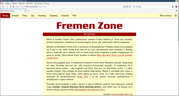
One of my top technical priorities was browser compatibility. I wanted to make sure that the website will work as intended, no matter the browser. This is something I have put a lot of attention to when designing the original Fremen Zone two decades ago. The difference is that back then I tested the page with Internet Explorer and Netscape Navigator, while now the tested browsers included Firefox (that’s my default browser), Chromium (I avoid Chrome like a plague, but acknowledge the fact that most people use it), Pale Moon (pre-Quantum fork of Firefox), links and lynx (terminal-based text-only web browsers), Dillo (an extremely minimalistic web browser), and Tor (privacy-focused web browser based on Firefox). Despite the multitude of modern browsers, the task was generally easier than 25 years ago.
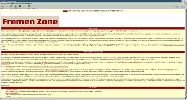
The new version of Fremen Zone renders as intended in Firefox, Chromium and Pale Moon. However, the more obscure browsers don’t always render the page as intended. For example, Dillo does not correctly handle CSS margins and width attributes, resulting, among others, in misaligned section logo images and incorrect text width:

Tor on the other hand, as part of its security measures, blocks web fonts. This results in incorrect rendering of the RSS icon on the right of the navigation bar (see Polishing the details section below for more details on web fonts).
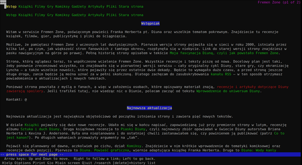
It was a fun exercise to get the page to look readable in text-based web
browsers. These browsers are obviously quite limited at what they can do, but
one thing they forced me to get right was correct semantic usage of HTML tags.
For example, I first started out with using stylized <div> tags for the
headers and sub-headers on the page. This looked as intended in graphical
browsers, but in text-based ones the headers rendered as a one-line paragraphs
of text and were indistinguishable from normal paragraphs. The solution was to
switch to dedicated header tags, <h1> and <h2>. In graphical browsers this
makes no difference since the styling is handled with CSS. However, text-based
browsers now interpret headers correctly and make them stand out from the rest
of the text.
I also wanted Fremen Zone to display correctly on mobile devices. In principle, I don’t really care much about smartphones - I consider them a horrible way of interacting with the Internet and rarely use mine to browse the web. But at the same time, I thought of this as in interesting technical challenge and a learning opportunity.
The biggest problem to overcome with rendering Fremen Zone on mobile was the
navigation bar. Firstly, the navbar is structured differently on desktop and on
mobile, forcing two copies of it to be defined in the source code. At any given
time, only one of those copies is visible, which is controlled by the @media
at-rules in CSS. Text-based browsers don’t handle @media at-rules as intended
and display both copies of the menu at the same time. Hence, the repeated
navbar in the screenshot above.
The mobile version of the navigation bar, instead of a list of available page
sections, contains only a “hamburger menu” icon. The proper menu becomes
visible once the icon is clicked. Sadly, getting this behaviour to work
requires a short JavaScript snippet attached via the <a> tag’s onclick
property. It isn’t a long script, just a few lines of code to add or remove a
CSS class that switches menu visibility, but it means that my goal of creating a
website that does not use JavaScript at all was not possible to achieve. Not
without giving up on mobile responsiveness, at least. I spent hours
experimenting with different approaches, hoping I can get things to work with
just CSS, but to no avail. I accepted that I need these few lines of JavaScript
and moved on.
Finally, there was the question of compatibility with various mobile browsers. Luckily, things went much smoother than on desktop. Essentially all browsers I tested - Firefox, DuckDuckGo, Vivaldi, Opera Mini, Edge - rendered the page as intended.
Writing a custom website generator
I spent approximately two weeks prototyping the layout. Once the initial design
was in place I began preliminary work on the contents. After creating several
subpages it quickly became apparent that pages contain lots of repetition, in
particular in the <head> and <navbar> tags. Surely, there were minor
differences - each page had a different <title> and each subpage’s navbar
highlighted a different current section - but the overall structure of each page
was identical. It was clear at this point that this repetition must be
eliminated. And so the next step was to write a custom static website
generator.
I decided to put each logical fragment of the page into a separate template file. For example, template for the page’s HTML header contains:
<head>
  <meta charset="utf-8">
  <meta name="viewport" content="width=device-width, initial-scale=1.0">
  <meta name="author" content="Jan Stolarek">
  <link rel="preload" as="font" type="font/woff2" href="RELPATH/fonts/fa-solid-900.woff2" crossorigin>
  <link rel="preload" as="style" type="text/css" href="RELPATH/styl.css">
  <link rel="preload" as="image" type="image/png" href="RELPATH/img/SECTION.png">
  <link rel="stylesheet" type="text/css" href="RELPATH/styl.css">
  <link rel="icon" type="image/x-icon" href="RELPATH/favicon.png">
  <link rel="license" href="RELPATH/LICENCJA.md">
  <title>PAGETITLE</title>
</head>
Putting all those repeating fragments into their own template files allowed me
to reduce each page to just its proper contents enclosed inside a <div></div>
block. Everything else - <head>, <navbar>, <header>, <footer>, etc. -
is stored in template files. This way all the repetition in HTML sources is
gone and changing, say, page’s <head> section requires modifying only the
respective template file.
I then wrote a bash script to assemble full HTML pages from templates and the proper source files. At the heart of the script are the following lines:
echo "<!DOCTYPE html>"        >  $HTMLFILE
echo ""                       >> $HTMLFILE
echo "<html lang=\"pl\">"     >> $HTMLFILE
cat $TEMPLATEDIR/head.html    >> $HTMLFILE
echo ""                       >> $HTMLFILE
echo "<body>"                 >> $HTMLFILE
echo ""                       >> $HTMLFILE
cat $TEMPLATEDIR/scripts.html >> $HTMLFILE
echo ""                       >> $HTMLFILE
cat $TEMPLATEDIR/navbar.html  >> $HTMLFILE
echo ""                       >> $HTMLFILE
cat $TEMPLATEDIR/header.html  >> $HTMLFILE
echo ""                       >> $HTMLFILE
echo "<main>"                 >> $HTMLFILE
echo ""                       >> $HTMLFILE
cat $SRCDIR/$FILEPATH         >> $HTMLFILE
echo ""                       >> $HTMLFILE
echo "</main>"                >> $HTMLFILE
echo ""                       >> $HTMLFILE
cat $TEMPLATEDIR/footer.html  >> $HTMLFILE
echo ""                       >> $HTMLFILE
echo "</body>"                >> $HTMLFILE
echo "</html>"                >> $HTMLFILE
There are some bash variables in here, but their names should be self-descriptive.
You might be wondering about the RELPATH, SECTION, and PAGETITLE words
used in the example template file above. These are reserved words that are
replaced with page-specific values using sed. This allows not only to have
page-specific titles and section logos, but also calculate relative paths:
# Insert relative paths
if [ "$FILEDIR" = "." ]; then
    RELPATH="."
else
    SLASHES="${FILEDIR//[^\/]}"
    DIRDEPTH="${#SLASHES}"
    RELPATH=".."
    for i in $(seq 1 $DIRDEPTH); do
        RELPATH=$RELPATH"/.."
    done
fi
sed --in-place "s,RELPATH,$RELPATH,g" "$HTMLFILE"
or insert last modification date from git:
# Add last modification date
LASTMODIFIED=`git log -1 --pretty="format:%cs" $SRCDIR/$FILEPATH`
sed --in-place "s,LASTMODIFIED,$LASTMODIFIED,g" "$HTMLFILE"
I like to keep all my projects organized, and so files that comprise the website
are placed into dedicated directories. For example, all images are placed in
img directory, while all kinds of resources (e.g. web fonts, a unique
non-generated 404 page, favicon) are in the res folder:
fremenzone
├── css
├── docs
├── img
├── res
├── src
└── templates
In order for all these files to form a coherent page that can be displayed in a
browser, they must be assembled into one directory - docs. This was initially
done by the same bash script that generated the pages from templates. The
script would first copy all images, resources and CSS files to docs, and then
it would proceed to generate all HTML pages, regardless of whether they were
changed or not.
This approach was very easy to program and worked well at first. However, as I
added more subpages, the approach of rebuilding every HTML page became a bit too
slow. Obviously, it wasn’t very slow, but slow enough that I had to
deliberately pause before pressing F5 in the browser after making changes to the
sources. It was time to write a proper Makefile for the page.
With a Makefile in place, only the modified files are regenerated. No more
rebuilding of all the HTML sources or copying of the whole image directory.
Switching the build process to make made rebuilding the modified sources two
orders of magnitude faster. The caveat is that rebuilding the whole website,
for example after calling make clean, is actually several times slower than
with the bash script. However, that is a corner case that happens very rarely.
What matters is that the most common use case has been optimized.
Polishing the details
At various moments during Fremen Zone development, I’ve spent quite significant amounts of time on getting the various details right.
HTML validation
First and foremost, I wanted to ensure that I write correct HTML. To this end,
I wrote a bash script that checks all the generated pages using
html-tidy, and created a dedicated make target
to be able to call it easily. The next step was to set up a GitHub action that
calls the script on every commit, just in case I miss something during local
development. Additionally, just to be extra sure, I’ve set up a GitHub
action that checks
generated pages using
html5validator.
RSS feed
One of the things I absolutely wanted to have on my page was an RSS feed. Again, I didn’t want to rely on any generators - this might not have even been possible, given that Fremen Zone does not take a format of a blog - which forced me to dive into RSS specification. Luckily, it’s not that complex, but it took some effort to make things work as intended. Not everything was clear from the specification, forcing me to peek into various generated feeds, such as the one generated by Hakyll for this blog. I also mixed in elements of Atom, so the feed isn’t purely in the RSS format.
Web fonts
Once an RSS feed was ready, I wanted to have an RSS icon in the navigation bar. This was surprisingly tricky to get right. After quite a substantial amount of research and experimentation, I figured out that the only reliable method that works on multiple different browsers is to use a dedicated glyph from an embedded web font. I went with an older version (5.15.4) of FontAwesome web fonts in two different formats, woff and woff2, the former one for those poor souls that use unbelievably outdated web browsers. Using a web font also solved the problem of displaying an icon for “hamburger menu” on mobile devices.
Optimizing loading times
At some point, I spent quite a significant amount of time on figuring out how to optimize Fremen Zone for faster loading. I admit that I am a beginner when it comes to the topic and I had to rely on pieces of advice found online - often conflicting, forcing me to dive deeper into HTML5 specification and browser documentation. One simple thing was to use a CSS minifier, a program that strips whitespaces and comments from a CSS file, making it more than 50% smaller. I also experimented with HTML minifiers, but couldn’t find one that would actually work without breaking the page and violating the HTML5 standard.
The next step in optimizing the loading times was related to embedded web fonts. Firstly, it is possible to strip the redundant glyphs from a font file. I only needed two glyphs from each of the two font files (woff, woff2), which allowed me to reduce file sizes from 40-50kB, to less than a kilobyte. Secondly, it is possible to preload the web fonts, i.e. instruct the browser in the HTML header to start loading the font files before the rest of the page is parsed and the glyphs from the font are actually requested. It is also possible to preload the CSS and other resources, which I did. I’m not exactly sure whether this has any benefits - the measurements I made using the browser’s developer tools were inconclusive. However, there seems to be no costs of attempting a preload, so I decided to keep it. For a brief moment I also experimented with lazy image loading, but realized that’s one of the features I absolutely hate on the web and dropped the whole idea.
Improving accessibility with alt attributes
When I set up the HTML validators, I got a bunch of warnings about missing alt
attributes for the <img> tags. This turned out to be another rabbit hole, as
I spent several hours trying to understand what alt attribute should contain.
And then I spent even more time writing the contents of those attributes. Long
story short, alt attribute should describe the contents of an image. Just
imagine someone asking you “what’s in this picture?” and you go to describe what
the image depicts. In the future, I’d like to learn more about making a web page
accessible for people using screen readers. Providing meaningful alt tags is
a small first step towards that goal.
Hosting the site
I don’t expect Fremen Zone to generate large traffic, and so for the time being I decided GitHub Pages should suffice as a hosting provider. There was a small catch, though. GitHub Pages can only host websites available in a public repository, at least on the free plan. However, I didn’t want to expose any of the in-progress work, notes, etc. The solution was handed to my by a colleague from work and is in fact trivial: use two repositories, a private one for development and a public one for hosting. For this reason, if you go to Fremen Zone repository you will only find the generated HTML files, LICENSE and README files as well as definitions of GitHub workflows. All the scripts discussed in this post are in the private repo.
To make updating of the public repository easier I created another dedicated script that performs a bunch of safety checks (no untracked files, no uncommitted changes, no unaddressed TODOs, etc.), and, if those pass, builds the page from sources and copies the resulting files to the public repository. I then need to manually commit and push the changes, which is another safety measure against publishing something unintended.
Summary
Front-end development is definitely not my cup of tee, but creating a website from scratch using only HTML and CSS was actually quite a lot of fun. By relying on the most basic technologies, I expect the site to be future-proof and easy to move to different hosting, once such a need arises.


